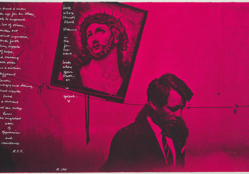
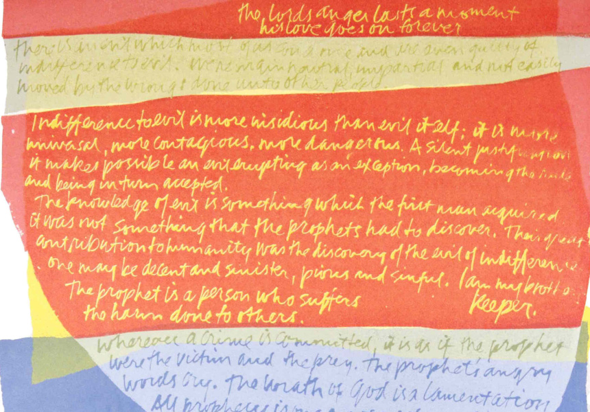
“Religious art” isn’t a phrase that excites the casual gallery-goer. But the casual gallery-goer hasn’t seen Sister Corita Kent’s pioneering, psychedelic and kinetic screen prints.
Corita wasn’t always obscure. For a few years in the ’60s and ’70s her work was part of the zeitgeist. Take a look at the back of the exhibition catalogue: it’s Corita on the Christmas 1967 cover of Newsweek magazine. Her work struck a chord in a cultural moment dominated by the Summer of Love, the hippy movement and pop art. But since then she’s faded into the background.
“Religion is desperately uncool,” says curator Simon Rees. “So she always remains slightly outside the mainstream.”
Never miss a Melbourne moment. Make sure you're subscribed to our newsletter today.
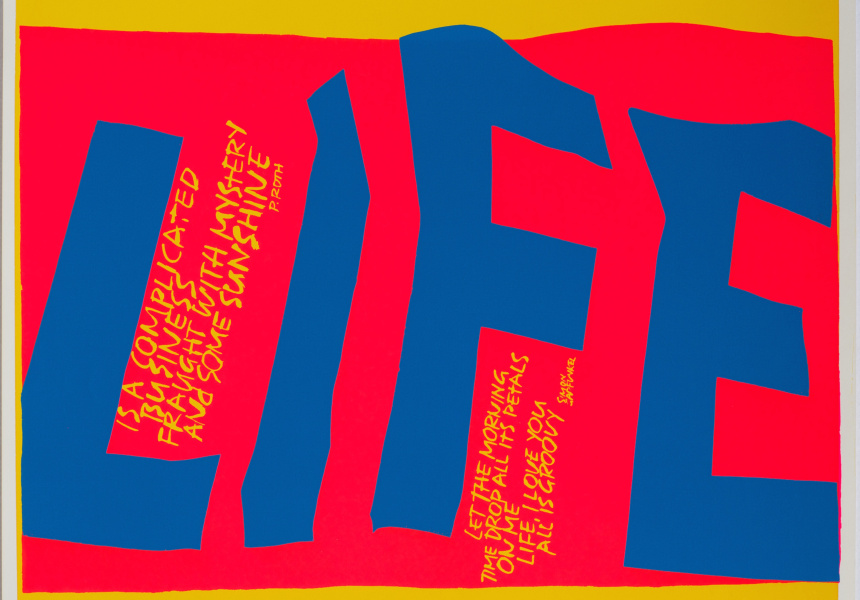
SUBSCRIBE NOWThere’s nothing uncool about Corita’s warped, twisting typography and collage, scattered with quotations from sources as diverse as Robert Frost and Hannah Arendt. The religious messages are there, but so are heartfelt, humanitarian messages of love and calls to action.
Rees was travelling across the US on a work trip when he first encountered the nun’s prints. “By the time I got to Cleveland I’d seen about five of her prints in artists’ collections,” he says.
He was not only drawn to her work, but to its obscurity. “I’m a typography and print junkie,” he says. “That’s my area. So why is it that here was something so communicative and powerful, on par with anything by Warhol, and I’d never heard of it?”
Then Rees saw the piece Eye Love, part of Corita’s Alphabet series. It’s a simple black, red and green print with a handwritten quote from Albert Camus: ‘I should like to be able to love my country and still love justice.’

Sister Corita Kent
Circus alphabet – E eye love 1968
screenprint
Courtesy of the Corita Art Center, Immaculate Heart Community, Los Angeles, CA
“When I saw that, I thought, okay. Here’s one of the great works of the 20th century,” says Rees. Big call.
Corita was at the forefront of the Catholic church’s attempts to modernise its image and approach. Out with the Latin liturgy, fire and brimstone approach, and in with a freshly humanitarian church, focused on building community and fighting for a better life here and now. It’s all there in Corita’s screen prints, which blend advertising slogans, hippy idealism and protest-movement urgency. “Come alive!”, “Power up!”, “Love!”, “Give the gang our best NOW!”
Now, Rees says, her influence is everywhere, particularly in the advertising world, where Corita-esque colours and handwritten type have become visual shorthand for “art” and “pop”.
And yet Corita’s work has barely been seen here in Australia. Neon Parc gallery in Brunswick held a small exhibition a few years ago. But this is the biggest collection of her work to ever visit Australia.
Rees says the religious aspects of her work have driven it underground. The word “love” at the time was being used to discuss “free love”, but Corita uses it in the sense of the love of God. “That’s one reason why the art world has kept its distance,” says Rees. “Because there’s that religious proselytism side of it.
“But it’s remarkably compelling,” says Rees. “And now we’ve got enough distance from its production to assess it properly.”
Sister Corita’s Summer of Love is at the Ian Potter Museum of Art until March 26.
