When choosing a colour scheme for my final piece, various elements of my research were combined. I sought inspiration from a variety of sources, not only through the art and design world, but also from physical precedent.
It was my intention to devise a colour scheme which was not only eye-catching but connected with the key word, geometry. It was important to retain the simplicity of the piece, therefore I opted to use a palette of only two main colours, and tints of these to reveal the hidden word.
The two colours used in the final piece are complimentary secondary colours; they are at directly opposite ends of the colour wheel.

Screenshot from Abode Kuler application; http://kuler.adobe.com/
To decide on the colouring for the final piece, I consulted colour theory and investigated the meaning behind the intended colours to ensure they were appropriate with the application and design.
The contrast between the blue and orange adheres to colour theory guiding, for research I used the following book;
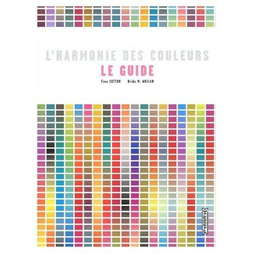
Sutton, T. and Whelan, B. M., 2004. L’harmonie des couleurs : Le guide. Singapour: Rockport Publishers.

Anon, n.d. Front Cover – L’harmonie des couleurs : Le Guide. [electronic print] Available at: <http://storage.canalblog.com/21/64/356162/17505906_m.jpg> [Accessed 4th January 2012].
Not only does the book identify hundreds of potential colour combinations, it also explains the use of colours and their associated meaning.
Appropriately, a meaning associated with blue is order, something present throughout my piece and representative of geometry. Therefore it is appropriate that the ordered elements, following the strict grid were blue.
Contrastingly orange is associated with energy and exuberance, highly appropriate for the geometric squares breaking up the extending blue pattern.


Anon, 2011. Images from L’Harmonie des couleurs : Le Guide. [photograph].
Researching further into colour theory regarding the choices of the blue and orange for the final design I became aware of a colour theory relating to equiluminant colours. Equiluminance relates to colours which have the same luminance, this creates the appearance of motion or movement, as we are unable to distinguish between the edges of touching shapes.1 As the colours I have chosen are equiluminant, it was important to ensure the blocks of colour did not touch or this would create instability within the piece, contrasting the aims.
When deciding on the colour scheme for the piece I believe I took influence directly from a variety of sources.
The combination of bright orange and blue is currently increasingly popular, with designers of all areas. Below are several examples of use of the colours influencing my choice.
Paula Scher – Maps Series

Anon, 2011. Front Cover – Maps. [electronic print] Available at: <http://www.tagfinearts.com/media/catalog/product/cache/1/image/9df78eab33525d08d6e5fb8d27136e95/m/a/maps.jpg> [Accessed 4th January 2012].
While not restricting herself to the two tone colour palette as I did, Paula Scher combines bright contrasting colours in a visually pleasing way in her Maps series.
Interior Design
Within the interior design industry the contrasting combination of blue and orange is being increasingly used, as outlined in this article for Houzz; http://www.houzz.com/ideabooks/23851

Anon, 2011. Kids Bedroom Design. [electronic print] Available at: <http://www.alinskie.com/wp-content/uploads/2011/06/orange-camerette-aurora-kids-bedroom-design.jpg> [Accessed 4th January 2012].

Anon, 2011. Dark Blue and Orange Design. [electronic print] Available at: <http://elyounes.com/wp-content/uploads/2011/02/dark-blue-wall-paint-and-dark-orange-interior-for-teen-bedroom.jpg> [Accessed 4th January 2012].
Finally I know I was partly influenced by the new London Overground Network. The refurbished and extended East London Line opened with a new colour scheme of blue and orange. The combination creates an impression of movement as well as ensuring a modernist feel.
London Overground Network


Transport for London, 2011. Adjusted Image from London Overground Design Standards. [original electronic print] Available at: <http://www.tfl.gov.uk/corporate/media/12523.aspx#lul> [Accessed 4th January 2012].

Transport for London, 2010. Visualisation of Hoxton Station. [electronic print] Available at: <http://www.designforlondon.gov.uk/what-we-do/space/london-overground-network/> [Accessed 4th January 2012].

Artofthestate, 2010. London Overground Train. [electronic print] Available at: <http://www.artofthestate.co.uk/london_photos/london-overground-train.htm> [Accessed 4th January 2012].

Anon, n.d. Interior of London Overground Train. [electronic print] Available at: <http://www.london2012.com/images/stectator-travel/overground.jpg> [Accessed 4th January 2012].
The colours chosen I believe reflect the ambition of the piece, to portray geometry with the simple colour palette reflecting the simplicity of geometry and the contrast creating energy within the piece.
As the final application of the design was for a book jacket, it was important that the piece be eye-catching to engage the viewers interest. The vibrant colours are visually attention grabbing and the associations with order suggestive of the topic.
—
Further Reading
Johnston, W., 2011. Design Friday – The Colour of Gulf Racing. [online] Available at: <http://modular4kc.com/2011/04/22/design-friday-the-color-of-gulf-racing/> [Accessed 4th January 2012].
References
1. Douma, M., 2006. Colour Vision & Art. [online] Available at: <http://www.webexhibits.org/colorart/anuszkiewicz.html> [Accessed 4th January 2012].
