Project 2 Design Brief and Inspiration
PROJECT 2: News Headline Poster Design DESIGN BRIEF
- What is the current news headline you’ve decided to work with and why?
I chose “Black Lives Matter” as my headline because I think it adapts well with Rodchenko’s style and the historic context that Rodchenko worked in, particularly for his earlier works.
2. Which historically significant designer are you using as an inspiration? List any interesting or relevant biographical details about this person?
Alexander Rodchenko is the designer I am using as an inspiration. Rodchenko was born in 1891, in Saint Petersburg, Russia, to working class parents. He grew to adulthood just prior to WWI, and became a prominent Russian Avant-garde artist, who did pioneering work in Constructivism.
Rodchenko studied at the Kazan School of Art and later relocated to Moscow. Rodchenko’s work was influenced by Cubism and Futurism and reflected his commitment to the Russian Revolution’s ideals. He worked not only in graphic design, but in photography and painting, although he abandoned painting in the 1920s, to return to it late in his life.
Rodchenko worked freely under Lenin’s leadership, but when Stalin came to power in Russia, Rodchenko appears to have struggled to balance his art and political ideals under the new regime. His photography was banned from several exhibits, yet he managed to escape official sanctions.
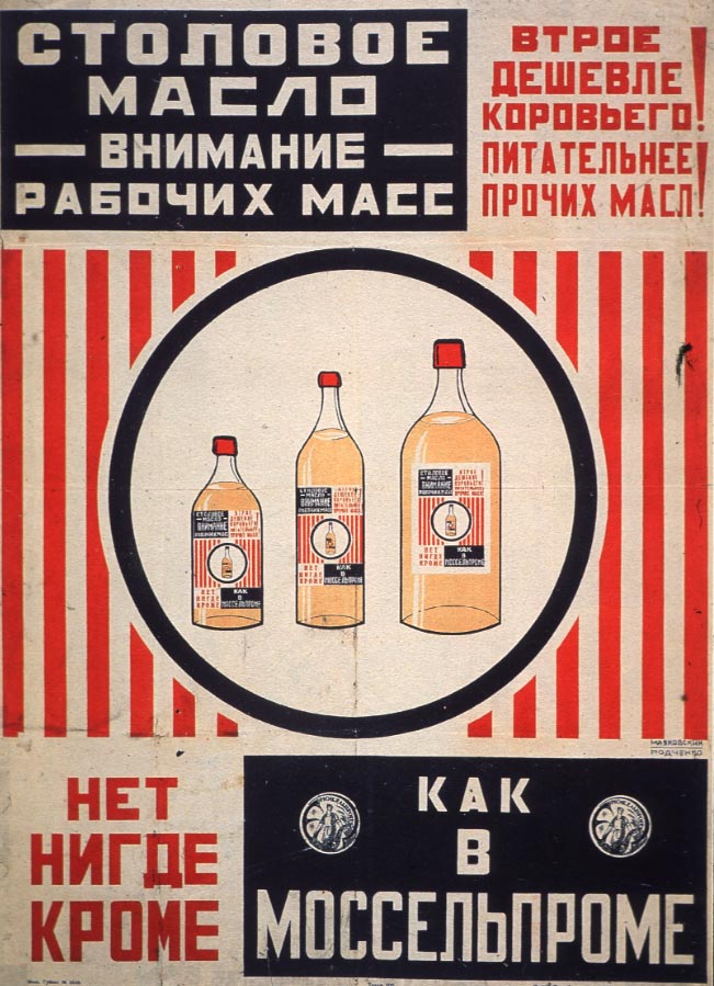
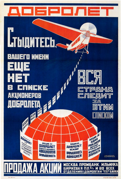
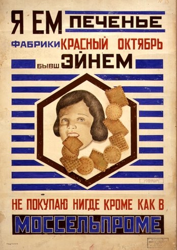
Some of Rodchenko’s most well-known work was his early graphic design posters, which have influenced countless artists since his time, including Shepard Fairey, Barbara Krueger and Franz Ferdinand. His posters were used as government propaganda and advertising art in the late 1910s and 1920s. The Stalin government changed its visual message and moved away from using Rodchenko’s work.
In 1928, Rodchenko joined “October Circle” of artists, but was later charged with “Formalism.” After this, he explored painting and abstract expressionism. He died in Moscow in 1956.
Learn more about Alexander Rodchenko here.
 3. Describe the visual elements within this designer’s work? What typeface or type style does he/she incorporate? Color palette? Layout and grid style? Is this designer included in a particular genre, era, and/or historical design cannon?
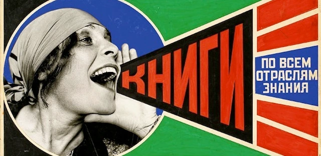
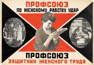
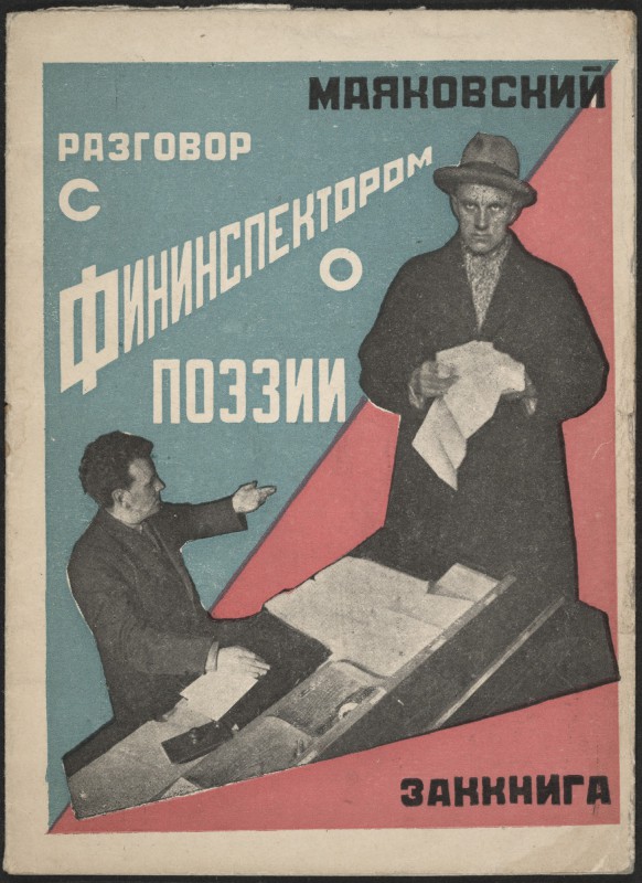
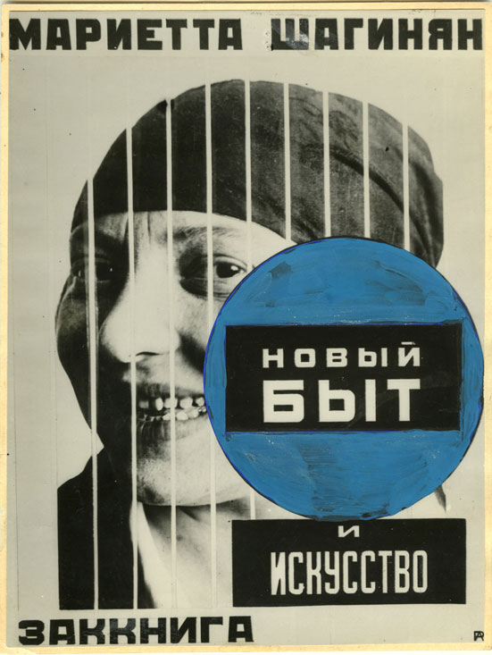
Rodchenko used primarily display type fonts in his poster work. He established a visual hierarchy by using varied sizes of type, rather than capitals and lower case.
 His color palette featured bold reds, orange-reds, deep blues and greens, against a newsprint-like background. He incorporated geometric designs and symmetry into his work, although many of his prints used asymmetrical balance.
As discussed in his bio, Rodchenko pioneered the Constructivism movement and was a part of the Russian Avant-garde. Some of his later works explored Productivism (which brought art to everyday life), and he was influenced by German DADA, Futurism and Cubism.
4. Discuss relevant themes, concepts, or issues from your designer’s work? i.e. political, corporate, educational
Rodchenko allowed his work to be used by the Russian government, primarily under Lenin’s leadership. Some served as political propaganda and other posters were used as advertising for products and films. Rodchenko supported the Bolshevick working class ideals, but this message isn’t as prominent in his work as one may think. His support for labor was more evident in the fact that he allowed the government to use his work as propaganda and advertising.
 In the early 20s, Rodchenko declared painting was dead. After this, he focused on graphic design, photography and photomontage works.
He continued to work under the Stalin government, but few personal anecdotes from his life survive. Retrospectively, we are left to surmise that he struggled to pursue his art, and not be branded an enemy of the Stalin regime. It appears he was successful, in that he worked as an artist until his 1956 death, and was not officially sanctioned by the government, although his work was heavily censored under Stalin.
5. What connections (aesthetic and/or conceptual) can you make with your news headline and your designer?
“Black Lives Matter” has become a rallying cry in the U.S., following the killing of unarmed black teen, Michael Brown, by police. It’s hard not to notice the similarity in the message being broadcast to many today, with the labor movement in Russia in the late 1910s–1920s. Though the messages differ, each became a call to action.
However, because the Russian Revolution was successful in overthrowing the czarist government, the new Russian government became the entity sending out the message. Rodchenko’s designs were used as a part of the government’s propaganda, as well as for other advertising. So, what started as a movement of the people, similar to the “Black Lives Matter” movement today, became a part of a government sanctioned propaganda machine.
Rodchenko’s bold colors, text and geographic lines lend themselves well to posters used as a call to action.
6. On your blog post examples of your designer’s work along with any other relevant details you’ve discovered during this research process.
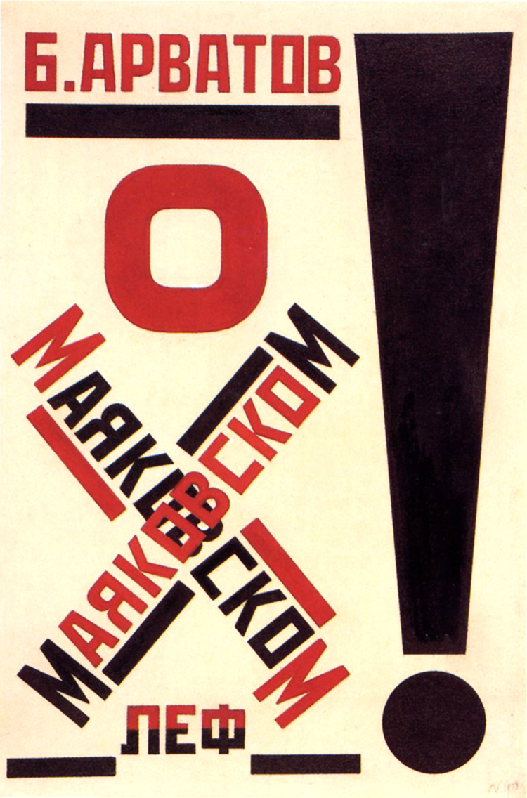
Inspiration from Alexander Rodchenko — for poster project.


I think you have chosen a powerful headline to go along with a bold designer. As you are going along – let me know if you choose to use a photo image, I am going to cover how to prepare those in class – and will help you on that. Looking forward to your poster!
LikeLike